
The observation
Many long-running service businesses have substantial experience but present it through an ageing fixed-width template. The evidence exists; the page hierarchy makes visitors work too hard to find it.
What the concept tested
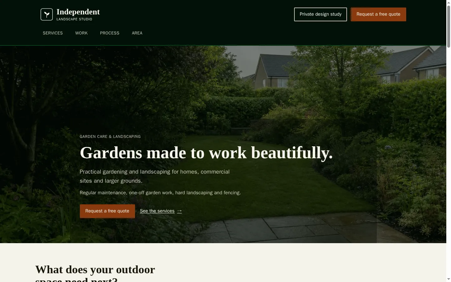
The study reorganised a homepage around a clear service overview, project evidence, an understandable working process and one enquiry path.
- A calm, practical visual direction rather than a glossy corporate treatment.
- Service information grouped by the decisions a customer needs to make.
- Project imagery given enough space to carry the evidence.
- A direct contact route placed after the service and process information.